

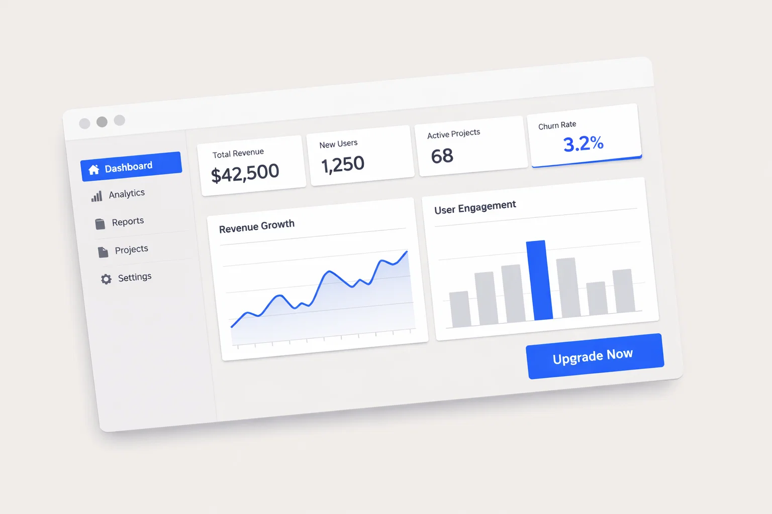
Designing a website to promote an application is not a visual exercise—it is a structured conversion system. Every layout decision, interaction, and content block must align with user psychology, business goals, and performance constraints.
Unlike generic marketing sites, application promotion websites must clearly communicate value within seconds, reduce friction to trial or download, and build trust in a highly competitive, skeptical digital environment.
High-performing application websites succeed because they:
- Clarify value instantly
- Guide users through a frictionless funnel
- Reinforce trust at every interaction
- Optimize for speed, mobile behavior, and intent-driven navigation
This guide breaks down the full UX and conversion architecture required to design such a site.
Executive Summary — What Drives Conversion for Application Websites
Application promotion websites (SaaS, mobile apps, platforms) operate in a high-choice environment where users compare alternatives rapidly. Conversion depends on clarity, perceived value, and ease of action.
Key UX Challenges
- Communicating value in <5 seconds
- Differentiating from competitors
- Reducing friction in signup/demo flows
- Building trust without physical interaction
Primary Conversion Goals
- Free trial signups
- Demo bookings
- App downloads
- Account registrations
Most Impactful Design Levers
- Above-the-fold clarity
- CTA hierarchy and repetition
- Feature-to-benefit translation
- Social proof density
- Page speed and mobile UX
Target Audience Behavior Profile
- Skims content quickly
- Compares multiple tools
- Skeptical of vague claims
- Mobile-first browsing (60–80%)
Summary Table
| Design Element | Priority Level | Conversion Impact |
| Hero Value Proposition | Critical | Very High |
| CTA Placement | Critical | Very High |
| Trust Signals | High | High |
| Page Speed | Critical | Very High |
| Feature Clarity | High | High |
| Mobile UX | Critical | Very High |
Understanding How Application Users Behave Online
Users visiting an app promotion website are typically solution-aware but undecided. They are evaluating whether your product is worth their time, data, or money.
Typical User Journey
- Awareness (via ads/search)
- Quick evaluation (homepage scan)
- Feature exploration
- Trust validation (reviews, testimonials)
- Conversion (signup/demo)
Behavioral Patterns
- Attention span: ~5–8 seconds above the fold
- Scroll depth: 40–60% average
- High bounce if unclear value
- Strong preference for visual explanation (videos, UI previews)
Trust & Skepticism Signals
- “Too good to be true” messaging reduces trust
- Missing pricing = friction
- Lack of real users = doubt
High vs Low Intent Behavior
| Behavior Type | High-Intent Users | Low-Intent Users |
| Time on Site | Longer sessions | Short visits |
| Pages Viewed | Pricing, features, testimonials | Homepage only |
| CTA Interaction | Clicks primary CTA | Ignores CTAs |
| Decision Speed | Fast if clear | Leaves if confused |
Information Architecture — Structuring Your Application Website
Clear structure reduces cognitive load and accelerates decision-making.
Recommended Site Structure
- Homepage
- Features / Product Overview
- Use Cases / Solutions
- Pricing
- Testimonials / Case Studies
- About / Company
- Blog / Resources
- Contact / Demo
Navigation Principles
- Keep top navigation under 6 items
- Include persistent CTA (e.g., “Start Free Trial”)
- Use sticky navigation
Flat vs Deep Navigation
| Model | Description | Conversion Impact |
| Flat | Fewer clicks, broader menus | Higher |
| Deep | Multi-layered navigation | Lower |
Content Prioritization (Above the Fold)
- Value proposition
- Primary CTA
- Key differentiator
- Visual proof (UI screenshot/video)
Homepage Design Strategy for Application Websites
The homepage is the highest-impact page and must immediately answer:
- What is this?
- Who is it for?
- Why should I care?
Must-Have Elements
- Clear headline (benefit-driven)
- Supporting subheadline
- Primary CTA
- Product visualization
- Trust indicators
- Feature highlights
- Social proof
Homepage Sections
| Section | Purpose | Conversion Role |
| Hero | Immediate clarity | First impression |
| Features | Explain functionality | Build understanding |
| Social Proof | Reduce skepticism | Build trust |
| Use Cases | Personalization | Increase relevance |
| CTA Section | Drive action | Conversion trigger |
Conversion Architecture — CTA Design, Forms, and Funnel Flow
Conversion is not a single action—it is a structured funnel.
CTA Strategy
| CTA Type | Placement | Copy Style | Impact |
| Primary CTA | Hero, sticky nav | Action-oriented | Very High |
| Secondary CTA | Mid-page | Lower commitment | Medium |
| Micro CTA | Blog/resources | Informational | Low–Medium |
Effective CTA Copy
- “Start Free Trial”
- “Get Started in 2 Minutes”
- “Book a Demo”
Avoid vague CTAs like “Learn More.”
Form Optimization Steps
- Minimize fields (email + password ideal)
- Use progressive disclosure
- Add inline validation
- Show privacy reassurance
- Enable social login if relevant
Trust Signal Architecture for Application Websites
Trust is a prerequisite for conversion in digital products.
Key Trust Signals
| Trust Signal | Placement | Credibility Impact |
| Testimonials | Homepage, pricing | High |
| User logos | Hero, mid-page | High |
| Ratings/reviews | Near CTAs | High |
| Security badges | Forms, checkout | Medium |
| Case studies | Dedicated pages | High |
Implementation Notes
- Use real names and photos
- Include quantifiable results
- Highlight recognizable brands
- Avoid stock testimonials
Mobile UX Design Considerations for Application Promotion
Mobile is the primary interaction channel.
Mobile Design Checklist
- Thumb-zone CTA placement
- Sticky bottom CTA
- Simplified navigation
- Fast-loading media
- Autofill-enabled forms
Desktop vs Mobile Priorities
| Aspect | Desktop Focus | Mobile Focus |
| Navigation | Full menu | Minimal menu |
| CTA Placement | Multiple locations | Sticky bottom |
| Content Density | Higher | Reduced |
Page Speed and Technical Performance
Performance directly impacts conversion and SEO.
Core Web Vitals Targets
| Metric | Target Benchmark | Conversion Impact |
| LCP | < 2.5s | Very High |
| CLS | < 0.1 | High |
| INP | < 200ms | High |
Quick Wins
- Compress images
- Use lazy loading
- Minimize JavaScript
- Use CDN
- Optimize hosting
SEO and Content Structure Supporting Conversion
SEO should attract qualified users and guide them to conversion.
SEO-UX Alignment Checklist
- Match content to search intent
- Use clear headings (H1–H3)
- Include internal links
- Optimize meta titles/descriptions
- Use structured data
Content Formats
| Format | Purpose | Conversion Role |
| Landing Pages | Target keywords | High |
| Blog Content | Educate users | Medium |
| Case Studies | Build trust | High |
Accessibility and Inclusive Design
Accessibility is both ethical and strategic.
Compliance Checklist
- WCAG 2.2 color contrast
- Keyboard navigation
- Screen reader compatibility
- Alt text for images
Accessibility Risks
| Element | Standard | Risk if Ignored |
| Contrast | 4.5:1 | Poor readability |
| Navigation | Keyboard access | Exclusion |
| Media | Alt text | Accessibility gaps |
Analytics, Heatmaps, and Continuous Optimization
Design decisions must be validated with real data.
Key Tools
| Tool Type | Use Case | Insight Type |
| Analytics | Traffic & conversions | Quantitative |
| Heatmaps | Click behavior | Visual |
| Session Replay | User behavior | Qualitative |
CRO Testing Process
- Identify drop-off points
- Form hypothesis
- A/B test variations
- Measure results
- Iterate
Common Design Mistakes That Kill Conversions
Frequent Issues
- Vague value propositions
- Hidden pricing
- Overcomplicated navigation
- Weak CTAs
- Slow load times
- Lack of trust signals
Mistake vs Solution
| Mistake | Recommended Fix |
| Generic messaging | Specific benefits |
| Long forms | Minimal fields |
| No social proof | Add testimonials/logos |
Comparative Analysis — Application Websites vs Adjacent Industries
| Factor | Application Websites | E-commerce | Service-Based |
| Conversion Goal | Signups/Demos | Purchases | Leads |
| Trust Signals | Reviews, logos | Reviews, ratings | Credentials |
| CTA Type | Trial/Demo | Buy Now | Contact |
| UX Focus | Clarity + onboarding | Product discovery | Trust building |
Transferable Insights
- E-commerce: urgency tactics
- Service sites: trust architecture
- SaaS: onboarding optimization
Implementation Roadmap for Application Website Design
Step-by-Step Plan
- Define KPIs and conversion goals
- Map user journeys
- Audit current site
- Build sitemap
- Create wireframes
- Design UI/UX
- Develop and optimize
- Test (QA + accessibility)
- Launch
- Iterate with data
Appendix — Metrics, Benchmarks, and Tools
Benchmarks
| Metric | Typical Range |
| Conversion Rate | 2%–5% |
| Bounce Rate | 40%–60% |
| Session Duration | 1–3 minutes |
Tools
- Design: Figma, Sketch
- Analytics: Google Analytics
- CRO: Hotjar, Optimizely
- Accessibility: WAVE, Axe
Frequently Asked Questions About Application Website Design
1. What is the most important element of an app website?
The value proposition in the hero section.
2. How many CTAs should a page have?
One primary CTA, supported by secondary ones.
3. Should pricing be visible?
Yes—hidden pricing reduces trust.
4. What is the ideal signup form length?
As short as possible (2–3 fields).
5. How important is mobile optimization?
Critical—most users browse on mobile.
6. How often should I redesign my site?
Every 2–3 years or based on performance data.
7. Do animations improve conversions?
Only if they support clarity, not distract.
8. How do I validate design decisions?
Through analytics, heatmaps, and A/B testing.